
Date
30 Januaury, 2025Writer
Sara AlghafariShare
Copyrights
Brande 2024Typography can significantly impact the usability of a website, yet it often goes unnoticed by users as they engage with content. It can influence how information is perceived, processed, and acted upon.
When done well, typography ensures users can interact with your website easily, improving their experience and overall effectiveness. Below, we explore how typography impacts usability and how to optimise it for your website.

01
Readability and Legibility02
Hierarchy and Organisation03
Accessibility04
Performance and Loading Speed05
Emotional Impact and Branding06
Mobile Responsiveness07
Testing and Iteration08
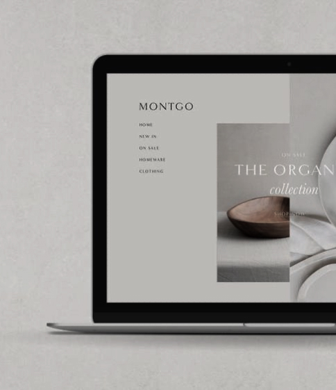
Readability and legibility are fundamental elements of usability. Readability refers to how easily users can comprehend long blocks of text, while legibility focuses on how quick and easy it is to distinguish one letter or word from another. Both qualities contribute significantly to a user’s ability to consume your content comfortably. Stats from a recent study show that using professional fonts can improve the user experience by up to 40%.
To enhance readability, ensure that your font choices suit the medium. For instance, sans-serif fonts like Arial or Helvetica work well for digital screens, while serif fonts like Times New Roman might be more suited for printed material. Maintaining an adequate font size is also critical; body text of 16px is generally recommended for most websites to avoid unnecessary strain on the eyes.
Spacing is another important consideration. Proper line height (or leading) and letter spacing can prevent visual clutter, helping users to follow text without difficulty. Avoid crowding words too close together or leaving too much space between them, as either extreme can reduce text cohesion.
Typography also contributes to a clear and effective layout through a visual hierarchy. A well-structured hierarchy helps users distinguish headings, subheadings, and body text, guiding them through content in a logical and intuitive way.
Using different font sizes, weights, and styles can emphasise important sections or points. For example, larger and bolder fonts can be used for headings, while regular weights and smaller sizes are appropriate for body text. Consistent use of typography throughout your website builds familiarity, which can help users locate the information they need more efficiently.
Combine typography with whitespace to segment content into digestible chunks. By avoiding walls of text, you can create a more inviting experience for your audience and make your website easier to scan quickly.
Making your website accessible ensures that it can be used by as many people as possible, including those with visual impairments or reading difficulties. Typographic choices often influence accessibility, so it’s essential to account for inclusivity when designing your site.
Contrast between text and background is one of the most critical accessibility considerations. The text should stand out enough to be legible, even for users with colour blindness or low vision. Dark text on a light background or vice versa typically works well, and tools like the Web Content Accessibility Guidelines (WCAG) can help you achieve optimal contrast ratios.
Additionally, avoid using overly decorative or complex fonts, as these can be challenging for users with dyslexia or other cognitive conditions to read. Providing options to adjust text size and line spacing can further improve your website’s accessibility, catering to users with unique needs.
While it might not seem obvious, typography can impact a website’s performance and loading speed. Custom web fonts, while visually appealing, can add extra weight to a website’s resources, potentially leading to slower load times. This can frustrate users and increase bounce rates, especially on mobile devices where connection speeds may be slower.
To strike a balance, limit the number of different font families and styles used on your website. Leveraging system fonts that are already installed on most devices can also save resources and boost performance. Additionally, using font-display settings and compressing font files can help improve loading times without sacrificing aesthetic appeal.
Typography doesn’t just affect usability – it also influences how users feel about your brand. The style of your typefaces and their arrangement can convey a wide range of emotions and messages. A clean, modern font might suggest professionalism and innovation, while a script typeface could evoke elegance or tradition.
Maintaining consistent typography throughout your website reinforces brand identity. Choose fonts that align with your brand’s messaging and values, and ensure they are applied consistently across headers, subheaders, and body text. By doing so, you’ll not only improve usability but also establish trust and recognition among your users.
With a growing number of users accessing websites on mobile devices, ensuring typography is responsive has never been more critical. Too small, poorly spaced, or misaligned text can create a frustrating user experience.
Responsive typography adapts to different screen sizes without compromising readability or usability. Scalable units like percentages or ems can be used to define font sizes, allowing text to resize dynamically based on the device. Design frameworks such as responsive grids can further ensure your text flows seamlessly as layouts adjust to varying screen dimensions.
Even with thoughtful typographic decisions, it’s vital to test how users interact with your website in real-world conditions. Conduct usability testing to understand how your type choices impact user behaviour and gather feedback from a diverse audience. Heatmaps, A/B testing, and surveys can provide valuable insights into areas where typography may need improvement.
Typography isn’t a one-size-fits-all solution. Regularly reviewing analytics and user feedback allows you to refine your designs incrementally, ensuring they continue to meet the needs of your audience over time.
Good typography is an invisible asset – when done well, it enhances the user experience without drawing attention to itself. By focusing on principles like readability, hierarchy, accessibility, and performance, you can create an inviting, navigable, and inclusive website. No matter if you’re building a new website or enhancing an existing one, thoughtful typography is a worthwhile investment that pays dividends in usability and user satisfaction.
A well-designed website is essential for creating a strong online presence and making a positive first impression on potential customers. As the best web design company in Dubai, our approach focuses on understanding your business goals, target audience, and unique selling points to create a website that is visually appealing, user-friendly, and optimised for conversions. From responsive designs to seamless functionality and strong back-end infrastructure, we ensure every element of your website contributes to achieving your business objectives.
Similar blogs you
might like
Lorem ipsum dolor sit amet, consectetur adipiscing elit, sed do eiusmod tempor incidi
dunt ut labore et dolore magna aliqua.
Interested in the flow